Add API Credentials
Request by sending an email to developer@vatom.com
Custom Login Overview
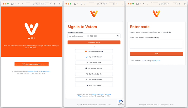
The login flow is a sequence of pages that prompt a user to sign in. It is presented to users who are not currently authenticated when they attempt to access Vatom services. When these services are accessed via a generic Vatom URL not focussed on a specific business ID, the login flow will have a Vatom branded look and feel.
The Custom Login settings let you optionally customize the look of the login flow that is presented when an unauthenticated user attempts to access Vatom services via a URL that references your business ID. This feature complements the customized experiences you build with Experience Kit, Wallet SDK, and Identity SDK.
Vatom Login Flow
There are three pages in the default login flow.
- Welcome
- Register
- Verify

In cases where a custom configuration is used, the Vatom Welcome Page at the beginning of this sequence is omitted and your configuration only applies to the Register and Verify pages.
Page Elements
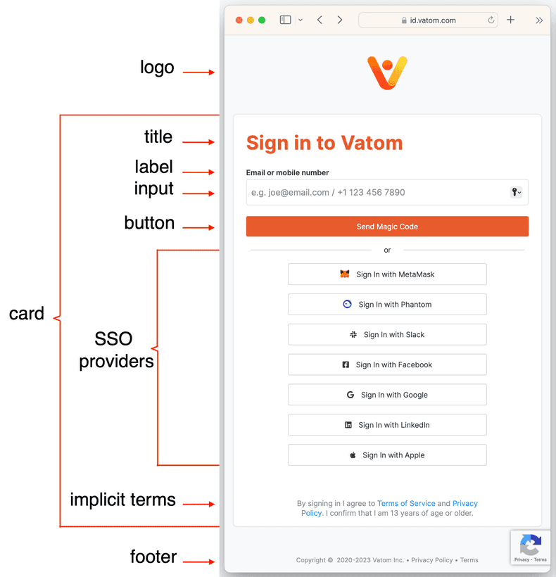
The following elements are defined for the login registration page. The verification page only uses a subset of these elements.

Configuration Settings
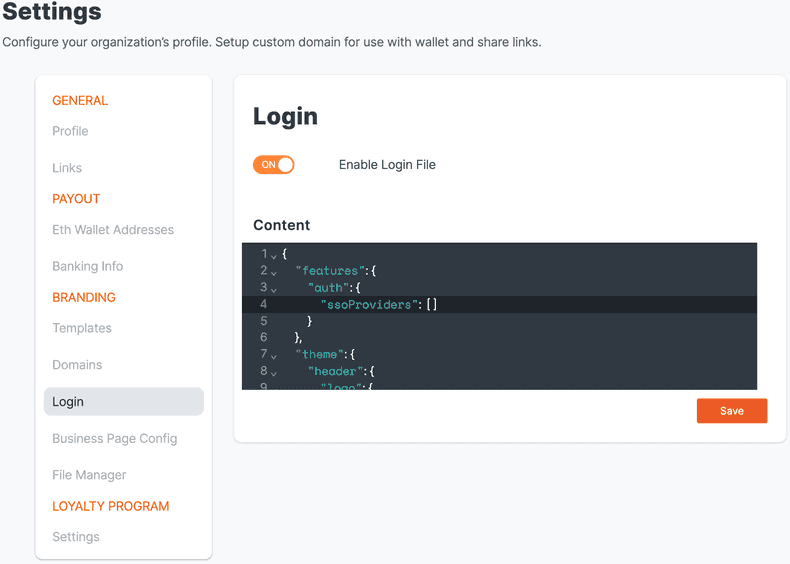
Your customized login page is configured via a JSON object uploaded to your business settings as shown in the example below.

Seleting Default, Custom, or Hidden Elements
At a high level, your first choice is whether to accept the default login flow or customize specific elements. When you turn on the Enable Login File setting shown in the image above, it initializes a JSON object which serves as a skeleton for the properties you can customize. The Configuration Sections documentation that follows provides instructions for specifying cofiguration options. Any elements not specified in the configuration will assume the default values. Since the skeleton does not specify details for any page elements, it will not override any of the defaults.
In some cases, you may simply wish to hide an element rather that accept the default or specify a custom variation. Some elements, such as a logo, are completely optional and may be hidden in your released version. Others would never be hidden in production because they are essential to a properly functioning flow. You may still benefit from the ability to hide any element during development and testing so that you can focus on changes to another element without distraction. For example, you may want to test the responsive rendering of the card rectangle overlayed on the background image without any other text or icons present. For details, see the following page:
- How to hide elements
- When focussed on customizing specific elements, it can be helpful to know how to explicitly hide other elements in examples.
Configuration Sections
The configuration is divided into the following key sections:
- features-auth-sso
- Select which SSO providers you wish to support.
- theme-background
- Specify styling for the background of the page.
- theme-card
- Specify styling for the card that serves as a container for the central body elements.
- theme-header
- Configure the header region of the page. This includes the logo image and title text.
- theme-input-label-button
- Specify styling for the text input box, its label, and its submit button.
- theme-implicit-terms
- Specify styling for the Implicit Terms text and links referring to a privacy policy, terms of service, etc.
- theme-footer
- Specify styling for the footer text.
- text
- Customize various text strings appearing on the page.
Example with Camel Case Property Names
The following example includes an abbreviated list of options and gives an idea of how the configuration JSON is structured. You may entirely omit any properties if you wish to accept their default values.
Note that Camel Case is used for property names such as backgroundColor and implicitTerms. This conforms to React style naming conventions instead of CSS conventions.
Configuration Example
{
    "features": {
        "auth": {
            "ssoProviders": [
            	"apple"
            ]
        }
    },
    "theme": {
        "background": {
            "style": {
                "background": "url('https://resources.vatom.com/abcBizId/login-bg.jpg')"
            }
        },
        "card": {
            "style": {
                "backgroundColor": "yellow"
            }
        },
        "header": {
            "logo": {
                "url": "https://resources.vatom.com/abcBizId/logo.png"
                "style": {
                    "marginTop": "2.5rem"
                }
            },
            "title": {
                "style": {
                    "color": "#003C80"
                }
            }
        },
        "label": {
            "style": {
                "color": "#003C80"
            }
        },
        "input": {
            "style": {
                "width": "100%"
            }
        },
        "button": {
            "style": {
                "color": "white"
            }
        },
        "implicitTerms": {
            "style": {
                "color": "black"
            }
        },
        "footer": {
            "style": {
                "color": "white"
            }
        }
    },
    "text": {
        "SEND_MAGIC_CODE": "Send Code"
    }
}